
Production of US Honey (1998-2012), Part One
I have been interested in the plight of honey bees since first learning about Colony Collapse Disorder, the term given to the mysterious cause of bees disappearing from colonies en masse leading to the colony’s demise. Given the importance of bees to the pollination of many major US crops (canola, almonds, oranges, and more) any threat to the health of bees is a reason for concern, but the unknown cause of Colony Collapse Disorder makes the problem all the more darkly interesting.
For this reason I was drawn to this dataset, the annual production of honey in the US, when I was searching for a project for this first blog entry. I was curious to see what can be learned about bees and their species health through the honey they produce.
About the data set
This project focuses on the production and price of US honey from 1998-2012. The dataset was downloaded from here, and represents a subset of the Department Of Agriculture’s National Agricultural Statistics Service Annual Honey Report. More information about the US honey industry, including details about this dataset and supplemental information I am not considering in this project, can be found here.
The dataset is organized by state and year for the following features:
- the number of colonies that produced honey;
- the yield of honey per colony in pounds;
- the total amount of honey in pounds produced in that state for the year, which is the product of the previous two features;
- the amount of honey in pounds that is held in reserve by producers and not sold that year;
- the price per pound of honey in dollars; and
- the value of the total amount honey produced in dollars, which is a product of honey production and price.
Goals
For part one of this project, my primary goal is to identify the general trends in the production of US honey. In particular, I am interested in answering the following questions: What determines the price of honey? How has US honey production changed from 1998-2012? How has the Colony Collapse Disorder impacted both the production and price of honey? Which states produce the most honey and how has that production changed? Further, are there any other trends noticeable in the data that are relevant for understanding how honey is produced and how the price is set? (Spoiler: yes, there are!)
The code I used to produce the figures and analyze this dataset can be found here. In the python notebook related to this blog entry, I include additional details on how I stepped through the analysis of this project that I exclude here for brevity.
Analysis
The features of the dataset can be divided into two parts: the supply of US honey and its value. The main goal of this first part is to understand how that value is derived. Since I am interested in the dataset features that relate to the price of honey, I first wanted to look for trends in the price of honey over time.
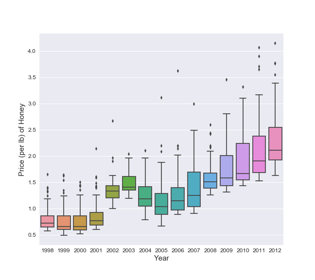
The plot above shows the distribution of the price per pound of honey in reporting states from 1998-2012. The median price and price distribution are both fairly constant from 1998 to 2001, establishing a baseline for the price of honey. The Colony Collapse Disorder was first reported in 2006 which coincides with a continual increase in the price of honey from 2006-2012. The most unexpected trend in the plot is a brief spike in the price of honey in 2002-2004. The spike peaks in 2003 before regressing nearly to the baseline in 2005. This spike precedes the start of the Colony Collapse Disorder in 2006 indicating that there was a separate temporary event that triggered this trend in the price.
(The points outside the whiskers show that each year there are a few states with unusually high prices. Since I am mostly interested in the general trends to start, I am going to ignore these handful of points for the time being.)
Next, I want to determine if I can identify the source of the trends in the mean price of honey in the features that describe the supply of honey.
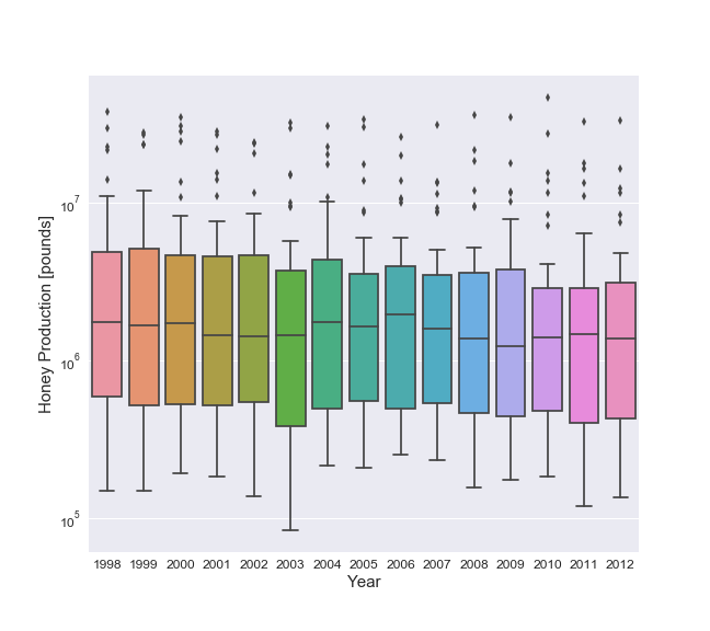
The distribution of honey production appears to remain roughly constant in 1998-2012. However, this boxplot is hiding the importance of the few outliers states that appear to dominate domestic honey production. In order to get a clear understanding of what is driving the trends in the price, I need to consider the total production of honey in the US. To do this, I need to create a new dataframe which aggregates the features into national totals (or mean values) for each year: the total production of honey in the US, the total number of colonies that produced honey, the mean yield of honey per colony in that year, and the mean price per pound.
After some experimentation with different combinations of features in the dataset, I found the best predictor for price each year is the sum of that year’s honey prodution with the stocks from the previous year, which I am referring to as the Market Size of US honey. This represents that amount of domestic honey that is available for purchase in any given year. The total market size for honey would include imported honey, which is not being considered for this analysis, but could be considered in a future post. When considering US Market Size we will not include the year 1998, since I do not know the honey reserved in stocks from 1997.
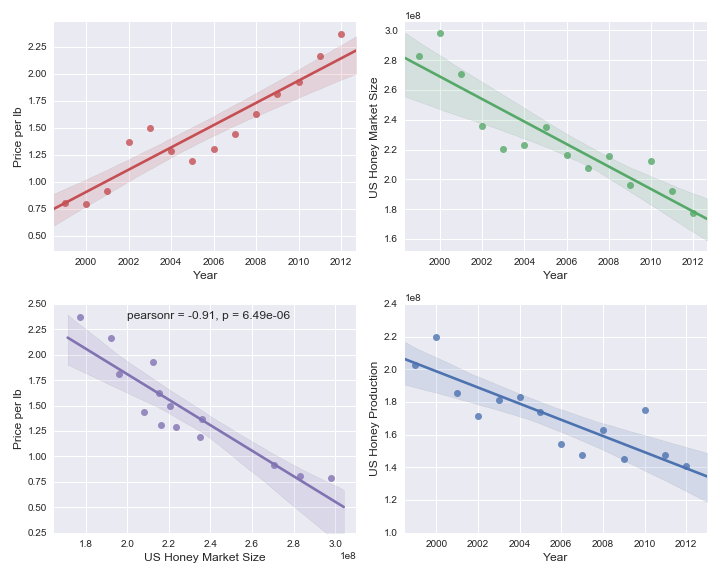
The mean price of honey in the US is steadily rising from 1998-2012 as shown in the top left panel in the figure above. This is related to the continuous decrease in the domestic market size of honey which is shown in the top right panel. The linear relationship between market size and price is shown in the bottom left panel where the strong statistical significance of the linear fit is annotated on the plot. The Pearson correlation coefficient (“pearsonr” in the plot) of the two features is close to -1 indicating the mean price of honey and the domestic market size each year are nearly linearly related. Further, the p-value of the linear relationship between the two is far less than 0.05, which shows a strong significance for the rejection of the null hypothesis that they are not linearly related. The correlation between market size and price naively makes sense as a decrease in the supply of honey, assuming a constant demand, should result in an increase in price.
Although not shown above, the honey produced per year is also correlated with the price of honey. This is not suprising since a majority of the market size comes from that year’s production. Comparing the two panels in the right column shows the trends of these two features are very similar.
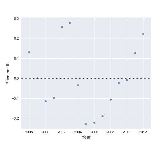
It is worth noting that the linear fit to the price of honey over time does a poor job describing changes in the price on small timescales. I illustrate that further in the plot below where, despite a small number of points, there are clear variations in the price with respect to the linear regression. As discussed above, the changes in the price of honey can be broken into three periods: a linear increase from 2005-2012 due to a linear decrease in market size likely triggered by the colony collapse disorder, a roughly constant price from 1999-2001 when the market size was also roughly constant, and a temporary peak in the price from 2002-2004 when the market size temporarily dipped.
I now know that the price of honey is set based on the market size of honey. Why is the market size decreasing over the full time period I am considering here and what is causing the variations on short timescales? In order to answer that question I need to examine the three features that make up the market size. The yearly market size of honey is the product of the number of honey producing colonies and the yield of those colonies summed with the amount of honey in reserve stocks from the previous year. The plot below examines how these features evolve from 1998-2012.
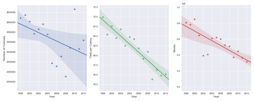
Overall the average yield per colony and the total number of honey producing colonies in the United States are both decreasing with time. Since the total domestic production is the product of these two features, both are responsible for the decrease in US honey production. The amount of honey held in reserve each year is approximately 20-40% of what is produced, therefore as the domestic production of honey has decreased, so has the amount in stocks. The combined effect of all three features decreasing with time shows why the US honey market size has decreased over the time period we conisder.
The number of honey producing colonies was slowly declining from 1998-2004. They precipitous drop in 2005-2008 shows how the Colony Collapse Disorder impacted the honey industry. Subsequent years show a possible rebound. The mean yield has continued to drop though. The cause for that is not clear from this dataset. I also do not see what caused the dip in the market size from 2002-2004. In order to understand what is driving the national trends in these two features, I need to consider the original dataset and look into the individual states more closely.
Summary
I have determined that the average price of US honey is correlated with the total amount of US honey on the market that year which consists of the honey produced that year and the honey held in reserve from the previous year. Overall the supply of honey on the US market each year has decreased resulting in a corresponding increase in the price. This decrease in the domestic market size is the result of a decrease in both the number of honey producing colonies and the average yield of honey they produce. The Colony Collapse Disorder caused a significant drop in the number of honey producing colonies which can explain a steady decline in the domestic market size from 2005-2012. However, I am currently unable to determine the cause of the short timescale dip in the US honey supply from 2002-2004.
In Part 2, I will answer the remaining questions: Which states produce the most honey and how has that production changed? What caused the drop in the market size of honey and related rise in price from 2002-2004?