
Production of US Honey (1998-2012), Part Two
This is Part 2 in my series of posts examining US honey production. In Part 1, I determined that the increase in the average price of honey is correlated with the decrease in the total amount of US honey on the market that year. The decline in the domestic market size from 2005-2012 can be readily understood as resulting from the Colony Collapse Disorder that caused the demise of many honey bee colonies. However, it was not clear what casued the short timescale changes in market size, e.g. the temporary dip below the linear trend from 2002-2004.
In order to get a better understanding of what is causing the changes in honey production year-by-year, we need to look at individual states more carefully. The python notebook for Part 2 that produced the plots in this entry can be found here.
The first thing to do is make a geographical plot of US honey production to visualize each state’s yearly production. I used Plotly, a python graphing library for making interactive plots, to construct an interactive map with a slider bar that allows the user to compare the honey production of different years. There are other interactive features, for example moving the cursor over a state in the map shows that states’s production for the year.
The plot above shows that a handful of the same states are far outpacing the rest of the country in terms of production. There are several states that are not included in the dataset, like Alaska, because those states do not disclose data for individual operations. The honey production of these states is lumped together in the annual Department Of Agriculture’s National Agricultural Statistics Service Annual Honey Report, but the total is small and can be safely ignored for this analysis as it will not impact any of the final conclusions. One other thing to note: several states only produce honey for a portion of the time, such as Oklahoma which only produced honey from 1998-2003. I’ll explore this further, later on in this post.
In order to more easily examine the relative production of honey by each state and identify the largest producers, I made two interactive bar plots using the Plotly package. To do this, I created a pivot table of each state’s total production per year in order to make the sorting of the data a little simpler when constructing these bar plots. The interested reader can refer to the code to see how that was done. Useful tip for exploring Plotly bar charts: double-clicking a year in the legend will remove the graphs from all other years.
By toggling the plot above to only show the years 1998 and 2012, it is easy to identify which states are responsible for the majority of honey produced each year. While the individual rankings vary, each year the top six states are the same: California, North Dakota, South Dakota, Florida, Montana, and Minnesota. These six states make-up 55-70% of US honey production each year. The following bar plot clearly illustrates that point if only those six states are shown by toggling the states below MN off. However, the interactive plot allows for further exploration for the interested reader.
I was curious as to why honey production is so concentrated in so few places in the country. After a small search, I found that these six states have major crops that require pollination by bees each season. In some cases bees are transported from one state to another and pollinate crops in multiple states.
Now that I know that US honey production is dominated by six states each year, I can examine how the production in those states change over time and how that compares with the states that produce the least honey. First I consider the market size of the top producing states.
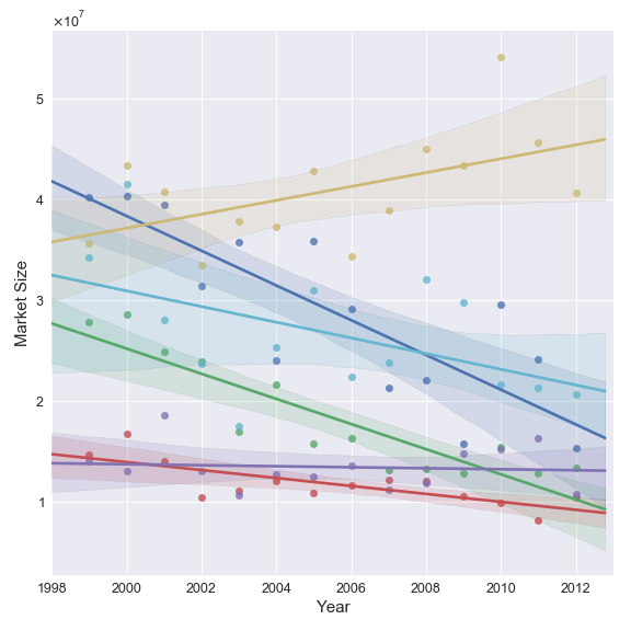
This is a little alarming! The market size of the top producing states are all in decline with the exception of North Dakota. The increase in the market size of North Dakota is not enough to overcome the decrease in the other 5 states as the total market size of these six states is decreasing. Since these states make up the majority of US honey production, the decline in the honey supply of these states is driving the domestic decline.
The next figure shows the factors driving the changes in these state’s market size.

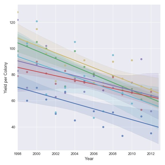
North Dakota, South Dakota, and Montana all show an increase in the number of colonies from 1998-2012, while simultaneously showing a decrease in yield of honey per colony. The honey yield per colony depends on the number of worker bees per colony as the average amount of honey produced per bee is approximately 1/8 of a teaspoon. If the need of these states for crop pollination is not abating, but the average number of bees per colony is decreasing due to the colony collapse disorder, that would explain why the number of colonies brought to/kept in these states is increasing. However, it is not clear whether the opposite is true for Florida, California and Minnesota where the number of honey producing colonies is decreasing. The assumption I am making about honey production and crop pollination being directly coupled could also be incorrect. This is a topic that would be interesting to explore more in the future.
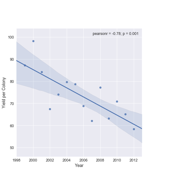
These six states also contain the key to understanding the drop in US market size from 2002-2004. The total number of colonies in these states is actually increasing over most of this time period. However, the mean yield per colony in these states was anomalously low in 2002. Something clearly happened in those states in that year that lowered yield of honey produced per colony. Since there is nothing in our data set that can give the cause, a quick search (thanks to narrowing the scope of what I needed to look for) revealed the answer: there was a bad drought in Western United States beginning in 2002. Note: a careful consideration of the yield from individual states in the figure above shows that Florida is not strongly impacted relative to the other states in 2002.
In order to understand what determines the amount of honey a single colony produces, e.g. do different bees produce more honey than others?, how important are environmental factors?, etc. I reached out to a friend who is an amateur bee keeper. I learned that while individual bees each produce roughly the same amount of honey, a colony will adjust the number of bees in the hive depending on resources available. Water is a critical resource for bees, the availability of which is a major determining component of a colony’s health. The drought in these states beginning in 2002 therefore led to a dip in the average amount of honey produced per colony, which did not fully recover to the trend until 2004.
This answers one my original questions: The brief spike in the mean price of domestic honey from 2002-2004 was the result a drought that dragged down the US market size by reducing the mean yield of honey per colony in an important few states.
Lastly, I want to take a quick look at the states that produce the least honey in total from 1998-2012: Kentucky, Maine, Maryland, Oklahoma, Virginia, and South Carolina.
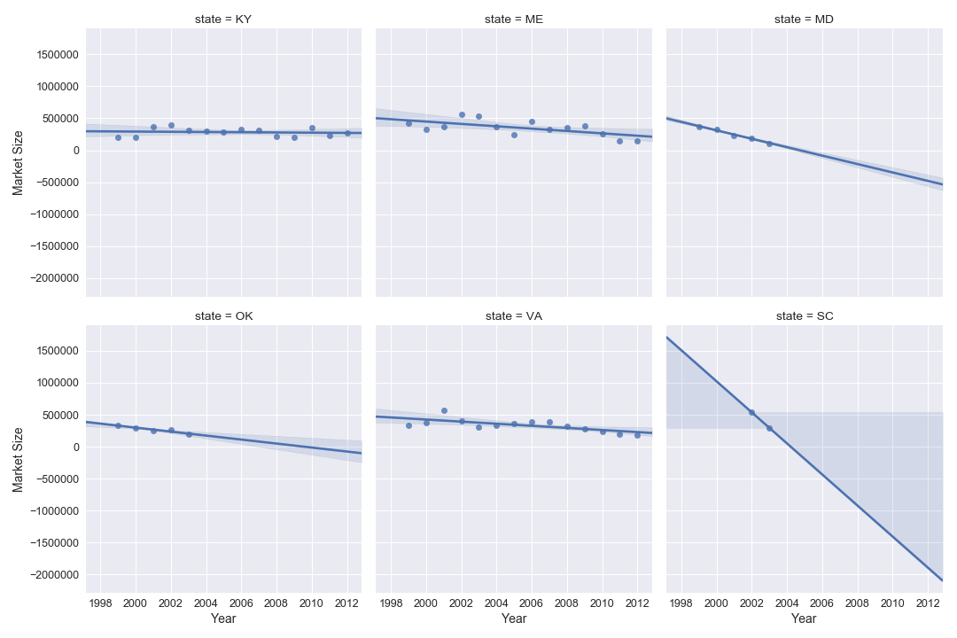
These states have either always produced a small amount or have ceased to do so after a steady decline. This does make me wonder about what is happening with crops in those states that need to be pollinated by bees, as this relates to conclusions I made above for the largest producing states. Since the dataset only includes bee keeping operations on farms, maybe these states have shifted to non-reporting bee keeping operations or are no longer producing those crops? The latter seems unlikey, particularly for the case of South Carolina where only two years of honey production is reported. Pollination and honey production may not be strongly linked in some states. Comparing honey production to crop yields that depend on pollination would be an interesting problem to consider in the future.